
 ESIGNING A LOGO FOR THE DAN MEYER CHOIR turned out to be one of those projects that sneaks up on you and reminds you why you love creative work in the first place. This logo was created for my friend Dan's choir, a Baltimore-based ensemble rooted in community, harmony, and shared musical purpose. Like many identity projects, it began simply, almost obviously, with a basic DMC logotype.
THE LETTERMARK PHASE
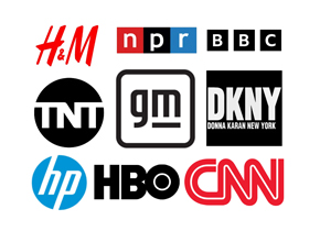 At first, the goal was straightforward: take the initials D, M, and C and imagine how they might live together as one clean typography. Looking at how famous brands perfected their respective lettermarks, I explored possible letterforms, weights, and spacing—running through the usual early exercises. Serif versions felt too formal. Sans-serif options leaned corporate. Everything looked fine, but nothing felt alive. For a choir, especially one grounded in human voices and collaboration, the early designs felt a little too polite.
BREAKING THE RULES
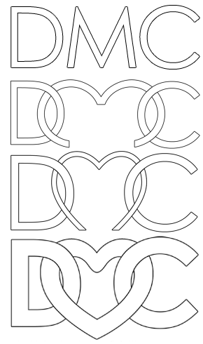 That was when I started loosening the rules. I let the curves breathe more. I allowed the letters to overlap instead of sitting neatly side by side. I paid closer attention to negative space and how the forms interacted with each other. A choir isn't about solo parts, it's about voices weaving together, and I wanted the mark to reflect that sense of blend and unity.
WHEN THE HEART EMERGED
 he sketchings began to mutate. The D opened up. The C wrapped inward. The M softened and dipped. There was a lot of erasing and redrawing, plenty of wrong turns, and more than a few moments where things felt messy. Somewhere in that process, a subtle heart shape appeared in the center. It wasn't planned or forced. It simply emerged from the geometry, which made it feel honest.
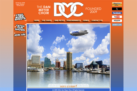
The DMC logo figures prominently in the Dan Meyer Choir website, which I also designed and currently maintain.
FROM MARK TO IDENTITY
I shared some of those early concepts with Dan, and even in their rough state, he could see the promise in them. When he finally saw the refined version, he genuinely marveled at how the design had evolved. That reaction was incredibly affirming, especially knowing how far the logo had traveled from its original DMC beginnings.
The final mark feels like a single, interlocking form. Three letters braided into one symbol. The heart is there, but understated. The curves suggest motion, continuity, and something musical, almost like a sustained note looping back into itself. It still clearly comes from DMC, but it has grown into something more expressive.
A NATURAL FIT
 or a Baltimore choir built on connection, collaboration, and love of music, the logo feels like a natural fit. It carries the history of its many experiments inside it—the early sketches, the discarded variations, and the small decisions that shaped what it became—even if no one else ever sees them.
There's something fitting about that quiet accumulation, as if the design holds traces of rehearsal rooms, conversations, and trial-and-error harmonies. And that feels exactly right: a symbol that reflects not just the choir's identity, but the process of how that identity was formed. (APJ)